Editor
(Please note that the editor itself is unfortunately currently only available in Dutch. However, with the instructions below, it is certainly possible to use the editor from English. We apologize for the inconvenience.)
The Editor tab allows you to edit images, choose backgrounds, add images, and add and modify text and shapes.
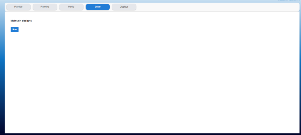
Open the Editor tab to start editing a (new) design.
When the Editor tab is opened for the first time, no (editable) images / designs are visible yet, and a relatively empty tab is displayed.
To do this, click the "New" button.
A pop-up screen is displayed to give the newly created design a unique name.

Give the design a unique name and click "Toevoegen".
The overview screen is displayed again.
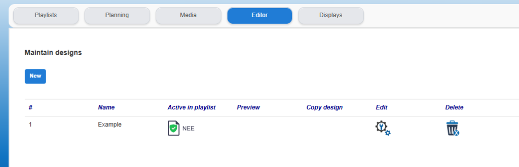
Click on the edit icon to start editing the design just created in the editor.
The editor opens in a separate tab with all functions currently available within the editor at the top:
(For an overview of the editor's functions, see below in this article.)

Before starting a new design, we recommend selecting the correct canvas size immediately and saving it. Therefore, choose a "Landscape" (Liggend) or "Portrait" (Staand) format right at the start of the design. Subsequently, the design can be further formatted and/or modified as desired.
After formatting, the design must be saved again and the editor can be closed.
Upon returning to the "Editor" tab after creating / saving the design, a number of additional icons will be visible:
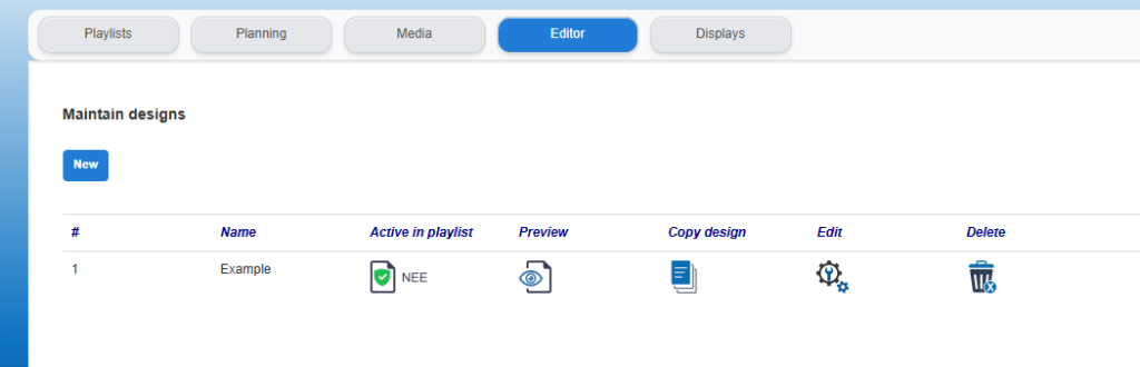
Next to the name, the following information and function are displayed:
- Active in Playlist; this immediately shows whether the image is currently being used in a playlist. Please note! If the design is modified here, this will immediately affect the image in the playlist.
- Preview; displays a preview of the design just created.
- Copy design; allows you to use the design again as a starting point for a new design; this can be useful, for example, if an image currently active in a playlist needs to be reused with a minor adjustment.
- Edit; the button discussed earlier to open the actual editor and create or modify the design.
- Delete; this allows the design to be removed from the list.
Once the design is ready, it can be placed in a playlist (from the media library) in the usual way, just like any other image.
PLEASE NOTE!
When a design or image is in use in a playlist and is edited or modified, this becomes immediately visible in the playlist. Therefore, modifying an image that is active in a playlist is not advised. To draw the user's attention to this, different icons are displayed in the "Editor" tab when an image is active in a playlist.
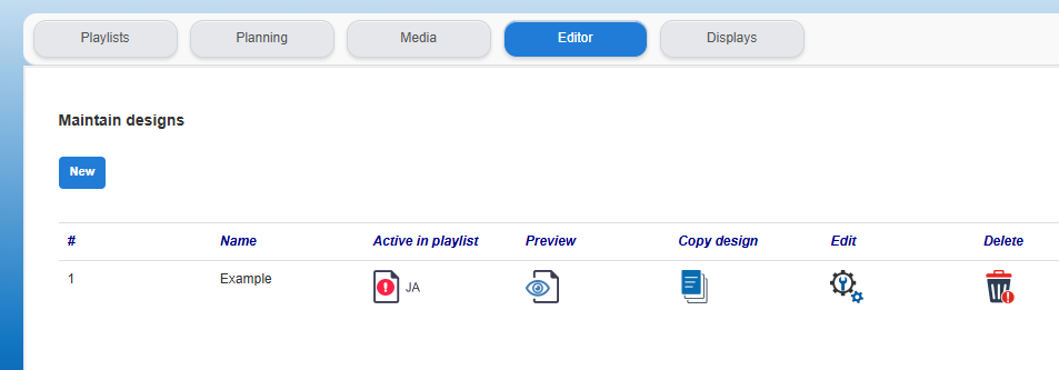
In the "Active in playlist" column, there is now a red icon  visible meaning that this design / image is in use in a playlist. Additionally, the icon in the "Delete" column has been changed to a red version.
If you decide to modify the image using the "Edit" button, a constant warning—a notification—is displayed in the editor's ribbon itself indicating that an active image is being edited.

CURRENTLY AVAILABLE FEATURES IN THE EDITOR:

-
- Save the design;
- Size / orientation - Landscape;
- Size / orientation - Portrait;
- Canvas background color;
- Canvas background image, image from your own PC;
- Canvas background image, image from the Media Library (e.g. template);
- Insert text block;
- Make text bold;
- Make text italic;
- Select font;
- Change text color;
- Insert square shape;
- Insert circle shape;
- Change fill color of the selected shape;
- Change border color of the selected shape;
- Change border thickness of the selected shape;
- Insert image from your own PC;
- Insert image from the Media Library;
- Delete the selected text, shape, or image;
- Close the editor.